System Thinking and UX Part 1: Exploring Systems and Our Addictions
I have a hypothesis. It is that the best path to the most straightforward user experience is through understanding the whole experience and that we are addicted to surface thinking. I believe this way of thinking leads to poor design, which is shallow and fragile.
I developed this hypothesis while working on a wide range of projects, working as a User Experience contractor. I have worked with some great UX people and fantastic companies on incredible projects. Any critical statements here are not a reflection on individuals or companies. They arise from work practices that are obvious and appear to work. Over time, I have seen many situations where, either during or after a project, the chosen solution was not the right one. It may have been an agile project where there was pressure to deliver without listening to the users or setting a problem to solve.
For years, I’ve been uneasy with teams rushing to solutions, and that unease has grown with the rise of ‘Lean’ methodologies. Something is missing, and this article is an attempt to turn that feeling into something more sustainable.
Here is my hypothesis.
Too many teams and organisations have become addicted to surface thinking, often without knowing it.
Surface thinking leads to User Experiences that lack sustainability and become fragile over time.
Teams don’t embrace what I call the Messy Middle, as it’s opaque and scary.
There is a false belief that embracing complex problems leads to complex experiences.
Here is an explanation of the terms I use here.
Surface Thinking
Surface thinking is when, the most obvious, a project uses that which is attractive and visible. It is the path of least resistance. For example, in User Experience, the user interface is the most visible and graspable thing. If given a significant problem, the team starts sketching interfaces, which is surface thinking. Design portfolio sites, such as dribbble, have led some new designers to need clarification on visual design with UX design. I and others have called this ‘The Dribbblisation of design’ (https://www.intercom.com/blog/the-dribbblisation-of-design/). On Dribbble, there are thousands of weather, dashboard and ticket mockups, none of which would survive the scrutiny of real-world use.
Surface Think goes beyond visual design. If a developer starts to code without the application being architectured, that’s surface thinking. If a product manager comes to a meeting with a solution rather than a business requirement, that’s surface thinking. It is the rush to a solution before understanding the problem.
A concept called ‘Bikeshedding’ explains more about why surface thinking happens. It comes from Parkinson’s Law of Triviality, a semi-serious ‘law’. It uses a fictional nuclear power plant as an example. In the example, the committee responsible for a Plant spends more time discussing what staff bikeshed than the details of the cooling system for the Power Plant. Everyone wants to feel they are contributing, and the easier it is to understand a subject, the more contributions there will be.
To put this in design terms, it is when the meeting lingers on a design detail, such as the colour of blue for a logo, something I labelled ‘The Wrong Colour Blue Syndrome’. It was good to discover that this was another version of Parkinson’s Law of Triviality. Surface Thinking is a form of the love of the trivial.
Sustainability
If a site is completely redesigned roughly every year, then it’s a good indication that the site is not being designed to be sustainable. If a site needs constant tactical projects to make it work, that’s also a good sign that the design is not sustainable.
Some projects I have worked on, such as a cinema listing, stayed live for over ten years. Others have had several significant redesigns. Some have had visual improvements, and the underlying structure remained intact. It is the sites that evolve that indicate that the problem was approached in the right way to start with, and it works for users now as it did then. These are sustainable solutions; they are hardy and survive.
It is very tempting for a new agency or a new member of staff to want to start a project with a blank sheet of paper. Starting afresh rather than attempting to understand the previous work is just easier. But this can lead to good ideas that work being thrown out with those that don’t. Trends, pet ideas, and chasing after competitors can all lead to unsustainable projects.
Messy Middle
This phrase I coined to describe all the stuff that isn’t on the surface. It’s all the differing requirements for different users; it’s the needs of the business and how they interrelate. It is about spreadsheets and lists of thoughts from multiple meetings. It is about going through the project's history, uncovering its origins and original intentions. It explores where the interdependencies lie and how workflows lead into the final project. It is all messy, and often, the past documentation, if it exists, is equally as confusing.
It can often be the case that a User Experience person arrives on the project and is given a set of features. The requirements may have been a wish list created in a meeting or from customer feedback. It bypasses the user's needs to reach a quick solution. There is a gap between the solution and what the user needs.
An example of Surface Thinking: Sky Plus Homepage
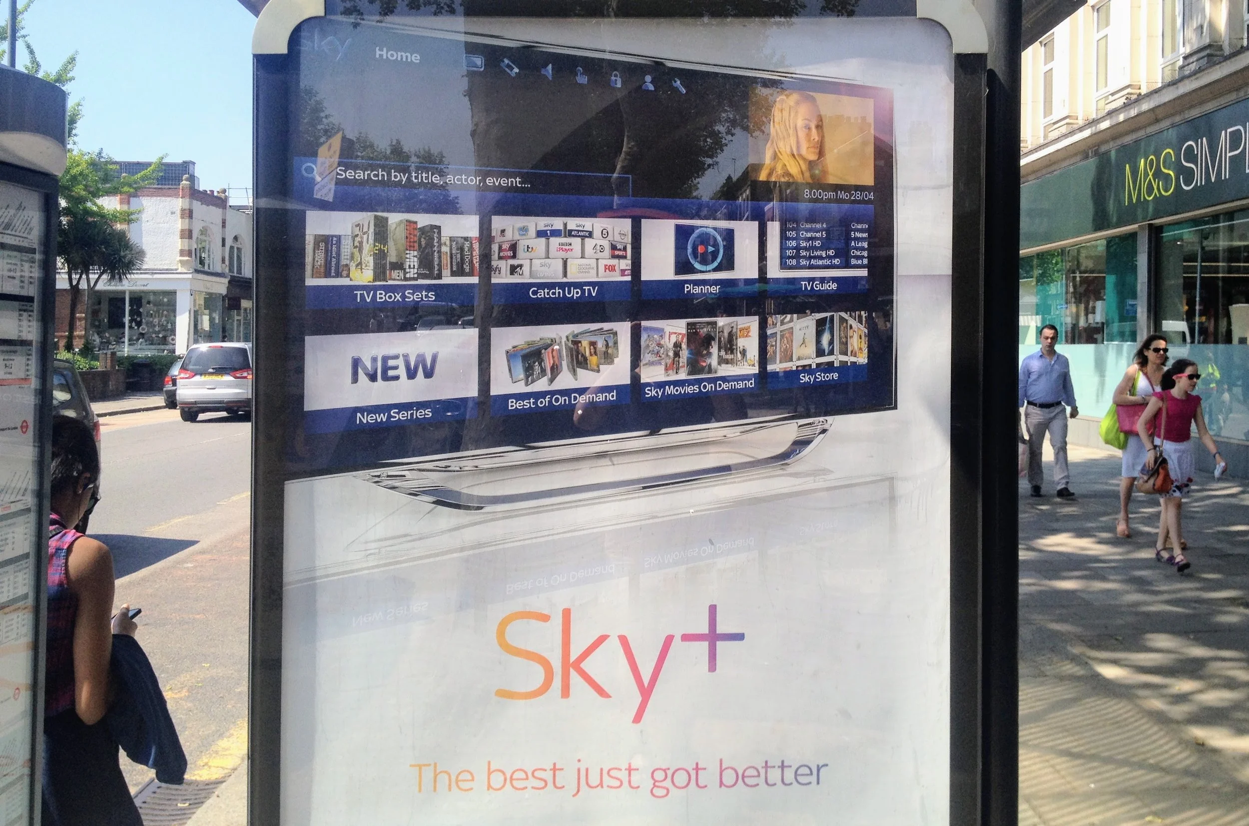
Bad UX examples, such as Apple’s recently retired iTunes, are not hard to find. Good designers create bad experiences when they have to deal with terrible project requirements or arbitrary limitations where put in place.
Often, the reason why something turns out the way it does is obscured by a chain of decisions made over multiple meetings. In this example, I have an inside view as I was one of the UX team who worked on it. I share responsibility for this.
This project was a new Homepage for the Sky Plus system in the UK. The home page is made up part of the EPG (electronic programme guide), which sits behind live TV. It is where viewers go to see what is on, what they’ve recorded, and to find on-demand content. The on-demand content was effectively patched into the EPG, which was designed to be a TV guide. It buried the on-demand content deep. When viewing a recorded programme or watching on-demand content, there was nothing to lead a user onto another episode or programme. The home page is an attempt to bring this on-demand to the viewer.

Here is a diagram that gives some context to this problem and shows the ‘universe’ of the EPG. It represents the ‘as is’ state at the time of my working at Sky and has no indication of future work, the reason it is safe to post. What it does show is how messy the platform had become. The circles represent the different areas of functionality, with the size showing the amount of use and importance to the company and the colours relating to various tasks. The box in the middle is the EPG with TV watching above it, the ancient on-demand services to the left and interconnection with other devices on the right.
The following diagram shows the button presses for some of the most common viewer tasks. Each action is a button press with an experience driven by a remote control. Mapping out the journeys shows how many button presses each thing takes. Each button press is something a viewer has to think about, and using colour buttons often requires a viewer to stop and look at the remote. This map showed that even simple journeys carried a high cognitive load.
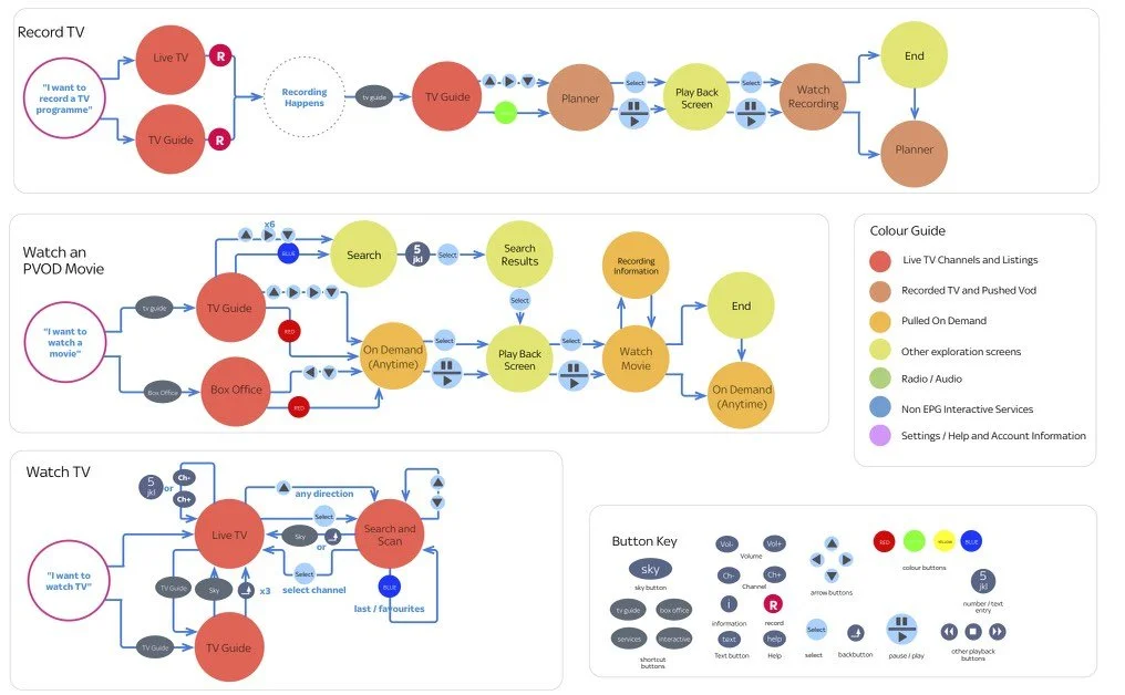
From this work, there was a fundamental issue with the way the EPG worked. The main problem was the lack of a programme information page where the user could select options for some content. There was a ‘before playing’ screen, but it was minimal. Instead, users highlighted an item from a list before button options were shown. Each action required a different button press, many hidden under coloured buttons. The limited buttons made this screen cluttered as the interface tried to guide the user.
A programme information page acts as a product page in an e-commerce experience. It is a page where users can perform actions using the arrow and action keys. It also has space to allow for related programmes to be shown — which was our suggested solution to make discovery easier. Other TV platforms use these information pages well, and it allows the platform to grow so can be viewed as sustainable. Each addition on the Sky platform required moving what buttons do and would confuse the users. One screen could have simplified the experience AND removed buttons from the remote control. Future systems solved the problem!
Exploring my Hypothesis
If surface thinking leads to shallow solutions, then what are the alternatives? The Messy Middle idea is a messy concept. How can it be solidified? Who else has written about it, and how can it be separated from the instant gratification of sketching an interface?
Another way to think about the messy middle is about trying to see the whole system from an interaction design point of view. Therefore, what we do is design systems, interactive systems. It leads me back to the title of my degree, Interactive System Design. My first business card proclaimed I was an Interactive System Designer. It may be more descriptive than User Experience Design, mostly because the system part leads people away from the idea of just designing interfaces. ‘System’ is the keyword here.
Towards the end of my degree, I developed a parallel interest in the field of ‘Artificial Life’, the study of life-like systems. For my final year project, I created a website on the subject, the first on the course. It was back in 1994, a time when Yahoo had only just put up its directory of web pages and interaction designers focused on software and CD-ROM creation.
Artificial Life provided my introduction to the world of non-linear systems and emergence. Non-linear systems are systems where there is little or no central control and where many simple, small systems interact. The behaviour of the system does not follow one linear path. The results can be chaotic and unexpected, as well as being surprisingly resistant to change.
Emergence is the behaviour that comes from non-linear systems. Emergence is when something becomes more than the sum of its parts. One example is an ant nest. It is a common misconception that the queen ant rules the nest. In reality, the queen is as much a slave as any other ant. The behaviour and intelligence of the ants’ nest emerge from the interactions of all the ants. Studying one ant may give the rules for that one ant, but only when that ant is interacting with other ants do those rules start to make sense. Just as an ant will not tell us how a system works, so surface artefacts are unlikely to tell us how the system works.
Discovering System Thinking
It was time to delve back into the world of systems. I read some system theory books and researched the subject online. After a few dead ends, I discovered a book called Thinking in Systems: A Primer.
This book proved to be readable, accessible, and covered systems in a way that started from basics before crossing over with my past reading. It introduced me to the concept of System Thinking.
System Thinking focuses on approaching a problem as a system, both from a practical and philosophical point of view. Emergence changes how we view an ants’ nest, and system thinking can make us rethink most things. My knowledge of system theory is still far from complete. So far, I have discovered some of the importance of the System in Interactive System Design and how System Thinking is very relevant to User Experience. There are more things to uncover.
Defining Systems
Saying everything is a system is just too broad. The book “Thinking in Systems” provides a more precise definition in its appendix. It says:
A system is more than the sum of its parts.
Many of the interconnections of a system operate through the flow of information.
The least obvious part of a system, it’s function and purpose, is often the most critical determinant of the system’s behaviour.
The system structure is the source of system behaviour. System behaviour reveals itself in a series of events over time.
Let’s work through these points from a User Experience perspective.
More than the Sum of its Parts
More than the Sum of its parts describes emergence, a concept that is part of Artificial Life and Chaos Theory. It confirmed for me the importance of not dwelling just in detail as that will not lead to an understanding of how a system works. In other words, fixing the User Interface is not the same as improving the User Experience.
Recently there has been a rise in relying on A/B testing to evolve sites and applications. These tests appear to be scientific and provide hard figures that are an excellent tool to persuade stakeholders. By trying different variations on a live audience, it is possible to find interface solutions that perform well. There are some obvious problems. For example, local maxima are when a solution gest stuck on a low peak on a fitness landscape with no way to cross the valley to a higher point. Emergence tells us that if we change individual parts of a system, we are likely to see effects in places other than where we make the change. In a busy live system, these will be hard to see, yet System Thinking tells us they happen.
Information that flows through a system needs to start somewhere and end somewhere. It is how this flows that form the structure of a network. An example of the purest form of a system is a bathtub. It has an inflow (the taps), a tub where water (the information) is stored (called a ‘stock’ in system terminology), and an outflow (the plughole). Tie the inflow to another outflow or stock (water in this case), and you get a feedback mechanism. A feedback mechanism is also a flow of information in the system. It is these flows that determine the architecture of a system.
A website, for example, is also a simple system with information taking the place of water. There are multiple flows, such as the number of users visiting the site and feedback is fed back via content statistics and other forms of user interaction. The more complex the application, the more levels of flows and feedback mechanisms there are, and the less linear the overall system becomes.
The Least Obvious Part of a System, its Function and Purpose, is often the most Critical.
From a UX point of view, the purpose of a project is often both clear and unclear at the same time. The aim of a site may be to sell things. That doesn’t carry enough information to design a good user experience. Many additional factors shape the system that could alter the whole design. For example, who the site is selling to and the brands sold. The year's rhythm also sets a cycle for change in the website. How John Lewis sells televisions requires a different approach to how Harvey Nicks sells dresses; it can’t just be boiled down to selling items.
The set purpose of a system alters the way the parts interact. The success criteria change the feedback mechanisms. In turn, this alters the behaviour of the system. For example, if a political party changes its doctrine and prioritises new jobs over, say, education, then this will change a government's behaviour more than its leader's change. Even in human systems, presidents and prime ministers have far less influence than their high profile in the media would lead us to believe.
System Structure is the source of system behaviour
So if changing the purpose of a system changes the behaviour of a system for a given system. What happens if you change were that feedback goes?
From an Information Architecture point of view, it is understood that the hierarchy of information presented to a user radically changes how the user interacts with it. For example, I have worked on the product hierarchy for John Lewis online, the large UK department store chain. Doing this increased the sales of items such as dresses, TVs and game consoles. The products were the same, but the structure was altered.
Understanding how changing a system's structure changes behaviour requires looking beyond single events. We need to look at how information, or users in the case of an online store, flow around a system. Single-page stats told us very little. By building journeys, we could see when users resorted to searching or watching them bounce between sections at regular intervals or giving up.
How a system is organised, or not, is often overlooked when looking to improve a system. Many large organisations have evolved by finding what works and then losing the reason why it works. A new person might not be able to why that structure works and, instinctively, reorganise it into something that is more ‘common sense’. Systems rarely obey the rules of common sense. Changing too much, too often will have effects that go unseen outside what has changed and have a knock-on effect. Changing the system goals will change how the system works. All these flows, feedback loops and structure lead to non-linear behaviours that are more than the sum of their parts. Any change will, therefore, affect the locality of that change.
In Part 2
We look in more detail at how this applies to User Experience and Service Design. We look at some potential ‘system traps’ that lead to poorly designed systems, including how it is easy to become addicted to interventions rather than solutions. I also explore some of the advice in ‘Thinking In Systems’ and how it applies to UX.